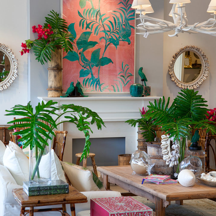
Say goodbye to Christmas and hello to some bright, happy colours in our Collaroy store windows.
If you love bright colours like these, but are unsure how to use them in your home, the trick is to define your colour palette in order to create a room that feels cohesive and well designed. A great way to choose your colour palette is to pick your focal point and pull colours from that. In the case of our Collaroy store windows we started with the fantastic artwork in the pic below. Placed on the mantel piece and with its use of complimentary colours (pink and green), this piece is definitely the center of attention. To make the room flow, we pulled out these colours and used them in the rest of the room through lush green foliage, bright pink bougainvilleas, a stunning Asian cabinet in green along with other pops of pink in books and a mirror. These fun colours have been paired back with natural elm timbers and white to allow your eyes to rest and create a relaxed feel that still feels bright and fun.
Do you have bright colours in your home? We would love to hear about them in the comments below.


